PRO Dashboard
Background and Challenge
A major challenge in treating rheumatoid arthritis (RA) is tracking pain and joint swelling over time. Unlike conditions such as high blood pressure or diabetes, which have clear numerical indicators, RA lacked standardized metrics for decades. About 25 years ago, rheumatologists introduced patient-reported scales for pain and swelling, giving clinicians tools to monitor symptoms and adjust treatments. When used in routine care, these patient-reported outcomes (PROs) have been shown to improve health outcomes.
Still, patients often struggle to interpret and act on their scores. Clear, meaningful presentation of PRO data can strengthen adherence, reveal treatment effects, and empower patients to manage their symptoms. To close this gap, SOM Tech partnered with Dr. Schmajuk at UCSF’s VA Health Care System to create a dashboard that makes PROs understandable and actionable, supporting informed discussions during routine RA visits.
Participatory workshop with patients
Participatory workshop with patients: design your ideal dashboard
From Observation to Action: Designing for Patient–Provider Dialogue
Identifying What Matters Most
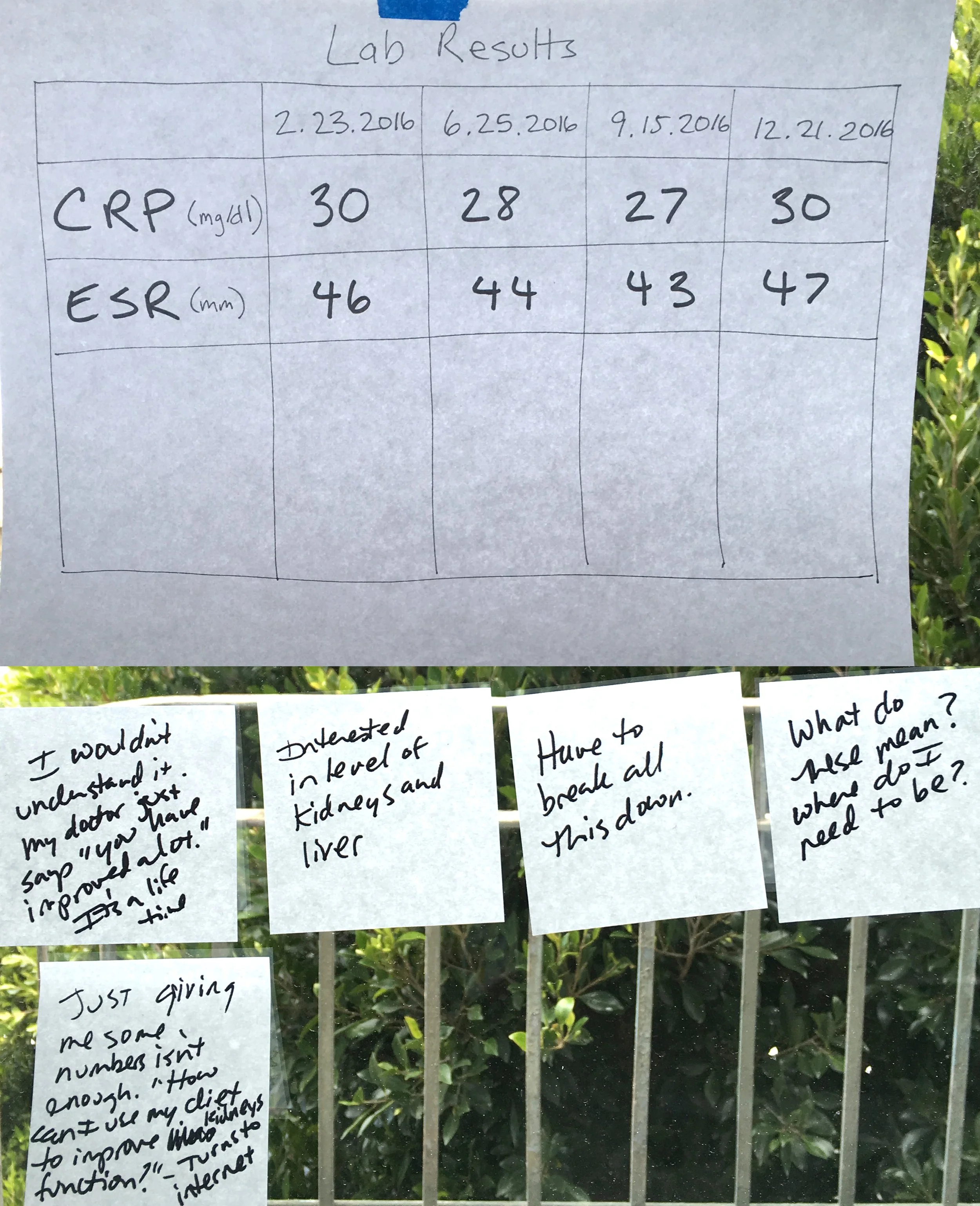
The study team recruited 45 patients and 12 providers from rheumatology clinics. Using a human-centered design approach, we conducted interviews, observed clinic visits, and facilitated participatory workshops.
These activities helped surface the data elements most valuable to patients and providers, while clinic observations revealed how a dashboard could be integrated into real-world workflows. During patient workshops, we asked participants:
What matters to you? Identify which information is most useful for daily care.
What works for you? Create your own chart using selected data elements.
Show me. Role-play a clinical visit to demonstrate how the dashboard might be used.
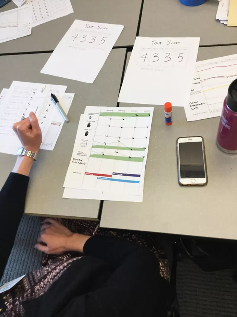
We tested paper prototypes with real patient data during clinic observations to understand how they shaped clinician–patient discussions. Insights from these sessions guided an iterative process combining evidence synthesis with direct observation.
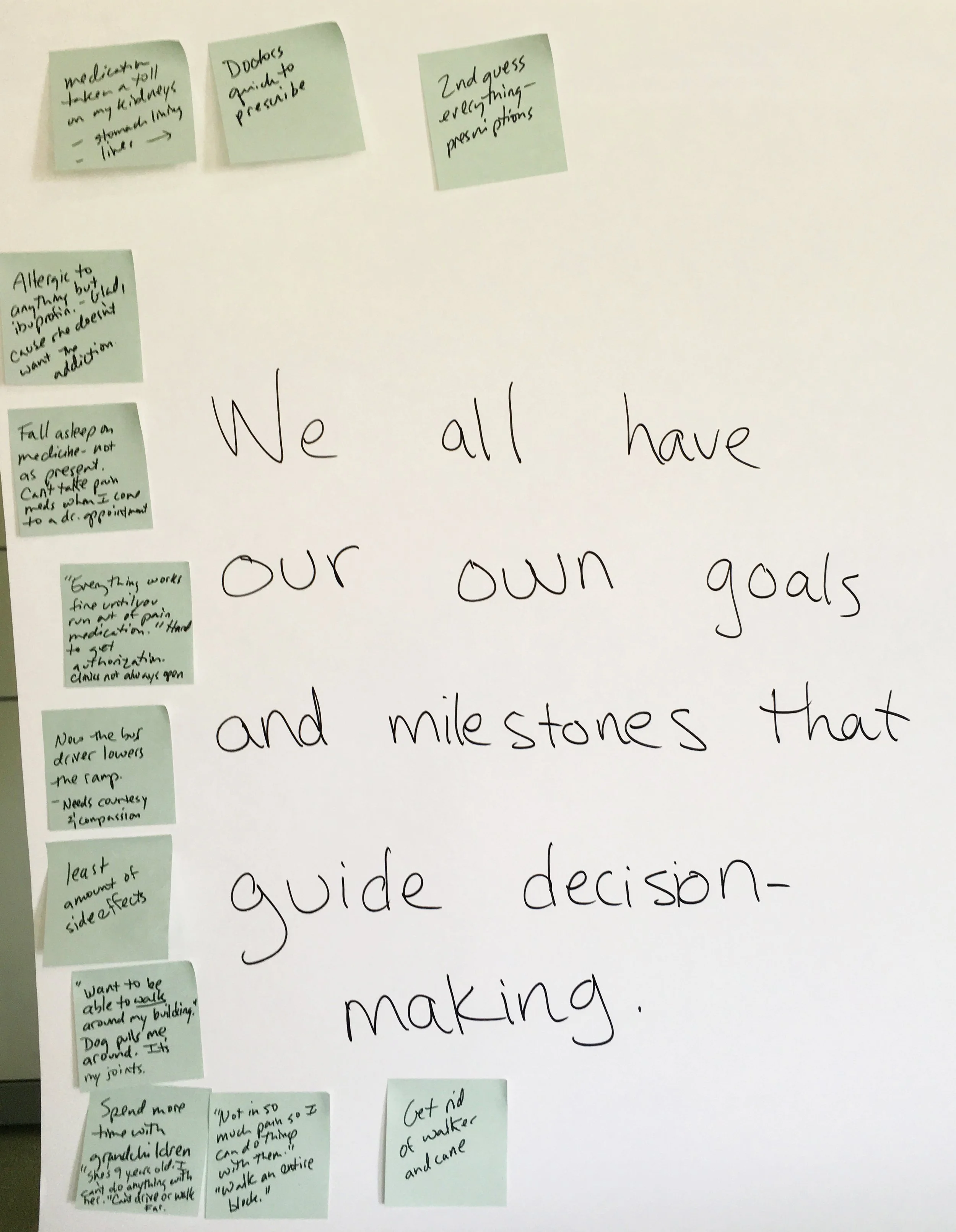
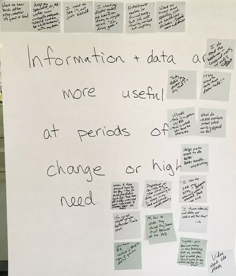
Although both patients and providers shared goals of assessing well-being and creating personalized treatment plans, they differed on which data were most critical for decision-making and for addressing the patient’s overarching question, “Am I OK?” Working groups with patients and providers helped reconcile these perspectives and refine the dashboard’s design.
The wireframes underwent several iterations before we felt the design would support productive conversations between patients and providers and was ready for development.
Wireframe
Building the Solution
A key challenge for SOM Tech was working within Epic. The team needed to incorporate patient-reported outcomes—subjective information about pain, symptom changes, and medication effects—which Epic does not natively support. Even doctors’ notes, which contain valuable insights, are difficult to search, organize, and chart, making it hard to track patients’ progress over time.
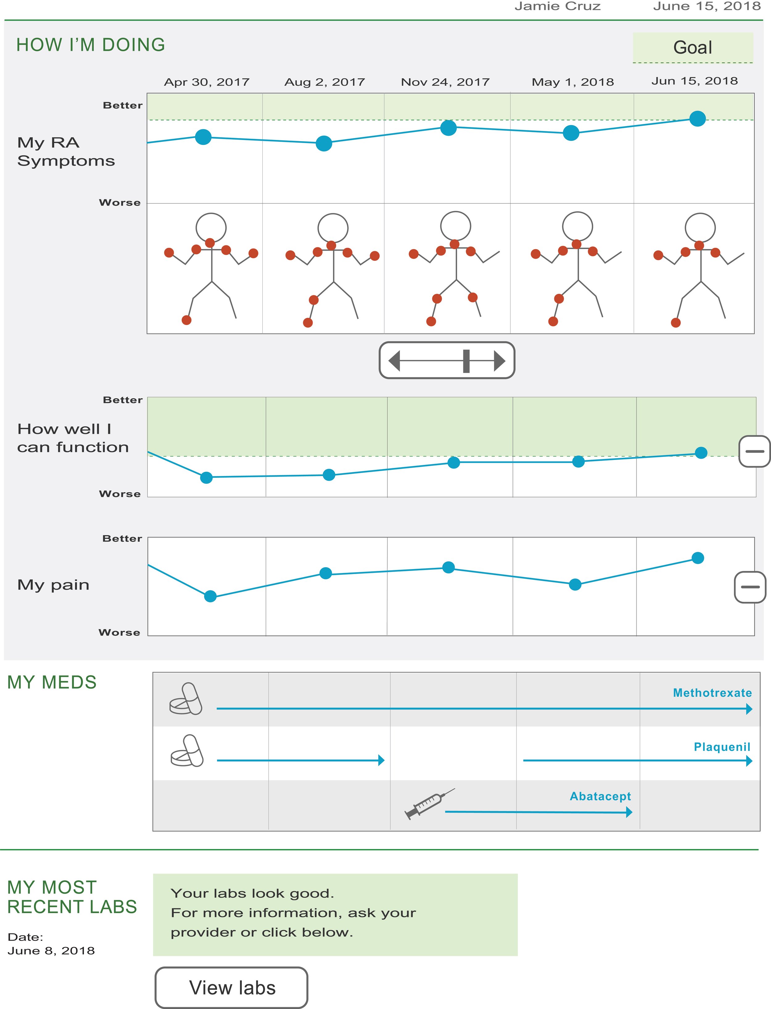
PRO Dashboard uses Salesforce for seamless integration with Epic. Accessible via a sidebar link, it automatically loads patient information alongside key questions about pain, disease progress, and medications. As patients submit responses over time, the system generates charts showing pain trends and overlays prescription history, including medication type, timing, and method. By consolidating this data into clear visual summaries, the dashboard allows physicians to quickly understand a patient’s history and progress, enabling focused, data-driven conversations during appointments without the need to dig through complex medical records.
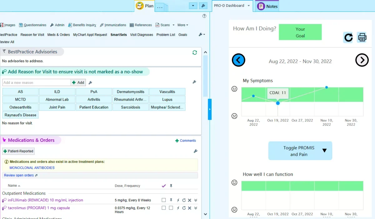
PRO Dashboard displayed on the right, reachable via a sidebar link
Outcomes and Impact
The final dashboard streamlined PRO data display, linked outcomes to medication regimens over time, and incorporated key lab values relevant to RA care. After multiple iterations, it is now fully operational, providing intuitive visualizations that help UCSF doctors share clear graphs with patients. These visual tools enhance understanding of disease activity, treatment goals, and medication adherence.
The system has been well received by both patients and rheumatologists, strengthening communication, empowering patients, and integrating smoothly into clinical workflows. “To be honest, it’s worked out better than I even imagined,” said Dr. Schmajuk. “We’re getting a lot of positive feedback from patients and from the rheumatologists at UCSF.”
Literature:
My Work
UX: participatory workshops, clinical observations, lit review
Wireframed and designed interactions
Created paper prototypes with real patient data
Conducted user testing