ZSFG Hospital Dashboard
Background and Challenge
The data landscape at the Zuckerberg San Francisco General Hospital and Trauma Center (ZSFG) was fragmented—a patchwork of disconnected sources stitched together without coherence—undermining stakeholders’ ability to generate trusted insights. No single system clearly showed how data connected to goals or purpose, leading to diluted meaning and frequent misinterpretation. As a result, stakeholders struggled to translate data into timely decisions, delaying action and limiting meaningful impact.
To address this challenge, the ZSFG Hospital Equity, Operations, and Quality Dashboard was created to unify key signals into a centralized, trusted, and timely view of patient flow—empowering hospital staff and leadership to drive improvements in safety, operational efficiency, and patient outcomes.
What We Set Out to Achieve
Unified data: Single, trusted, Power BI dashboard for equity, operational, and safety metrics
Faster reporting: Streamlines city reporting while ensuring alignment with national and local standards
Equity insights: Enable targeted interventions through stratified, equity-focused data
Operational visibility: Real-time patient flow and volume tracking
Performance tracking: Progress and outcomes against goals
Intuitive, user-centered design
“There is not one source of truth that everybody goes to. It’s usually the source that they’re comfortable with and, or that they’ve been able to get information from.”
“I would love to be able to use data in a real-time fashion and saying like, this is our organization’s dashboard today. Here are the bottlenecks around flow. Here’s where we need to focus to address this bottleneck. Here are the main sort of flow stoppers that are happening right now.”
Creating Shared Alignment
To align stakeholders and ground the work in real operational needs, a broad cross-section of hospital partners were engaged—including clinicians, department leaders, operational managers, the Equity Council, Kaizen Promotion Office, the Patient Safety Department, and Quality Improvement. Through collaborative workshops, we built a shared understanding of goals, constraints, and user needs to support purposeful, outcome-driven design. Below are a few of the exercises we used to get there.
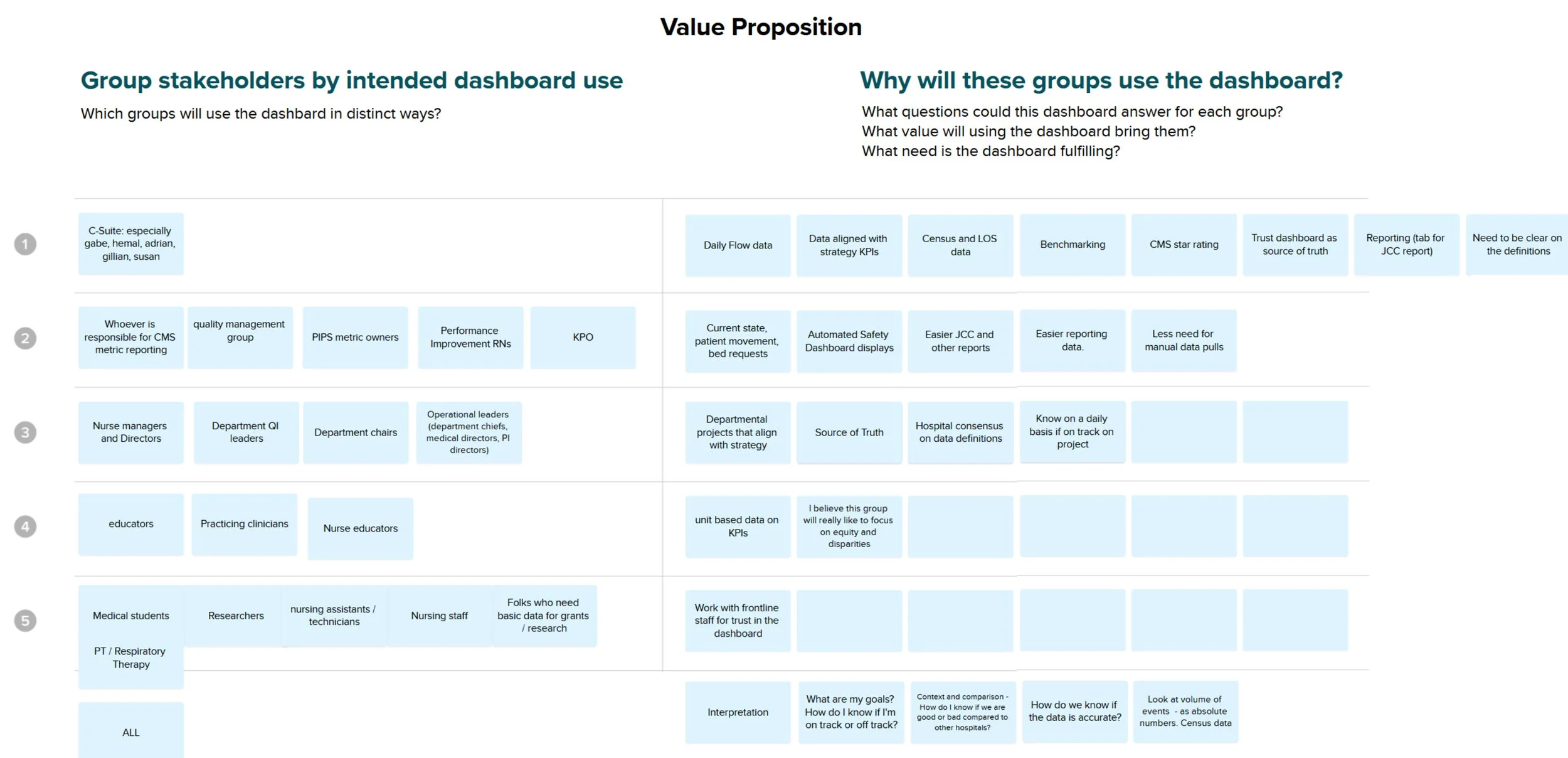
Value Proposition
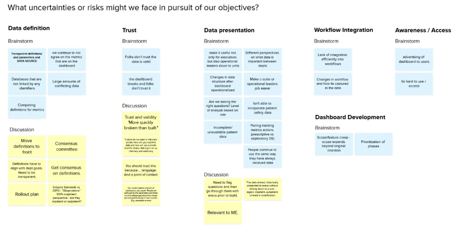
Risk Identification
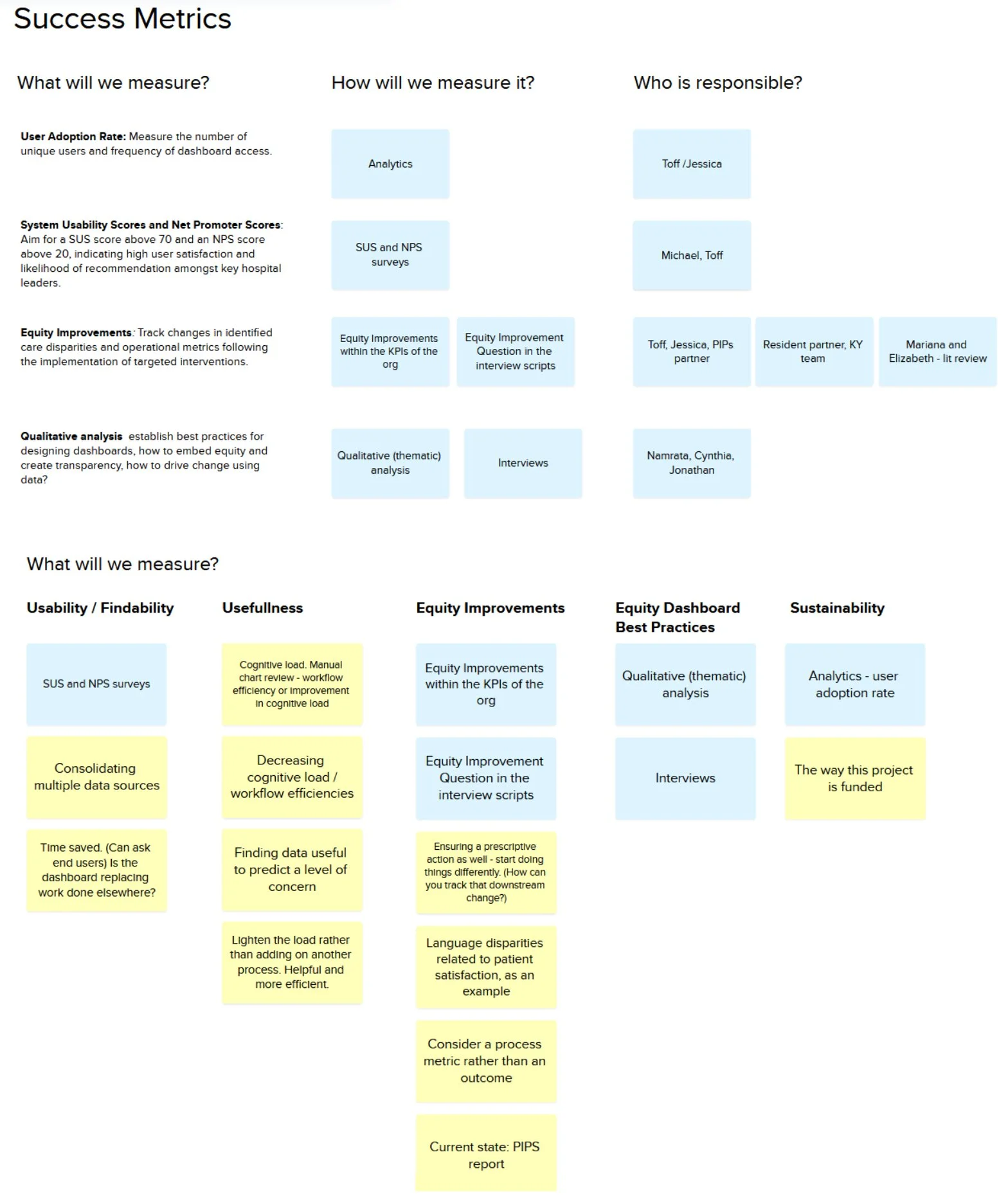
Success Metrics
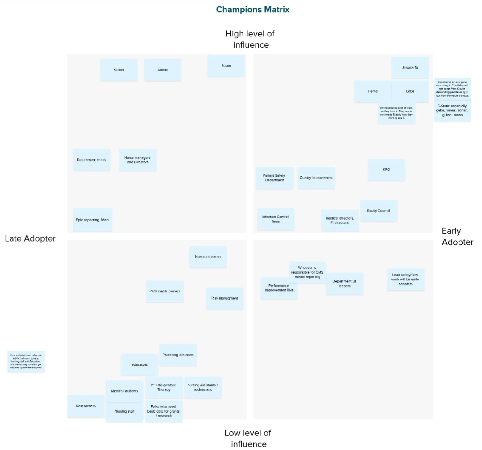
Champion Matrix
Unearthing Patterns
The team aligned on what we wanted to learn from our stakeholders. Through semi-structured interviews with 22 stakeholders across ZSFG, I explored how leadership and teams define success, access data, and make decisions. The synthesis revealed five recurring themes:
Patchwork Data: Stitching Together What We Can Find
Where Trust Unravels
Making Meaning: by Purpose
Making Meaning: Pattern vs. Pulse
Driving Change: Turning Data Into Decisions
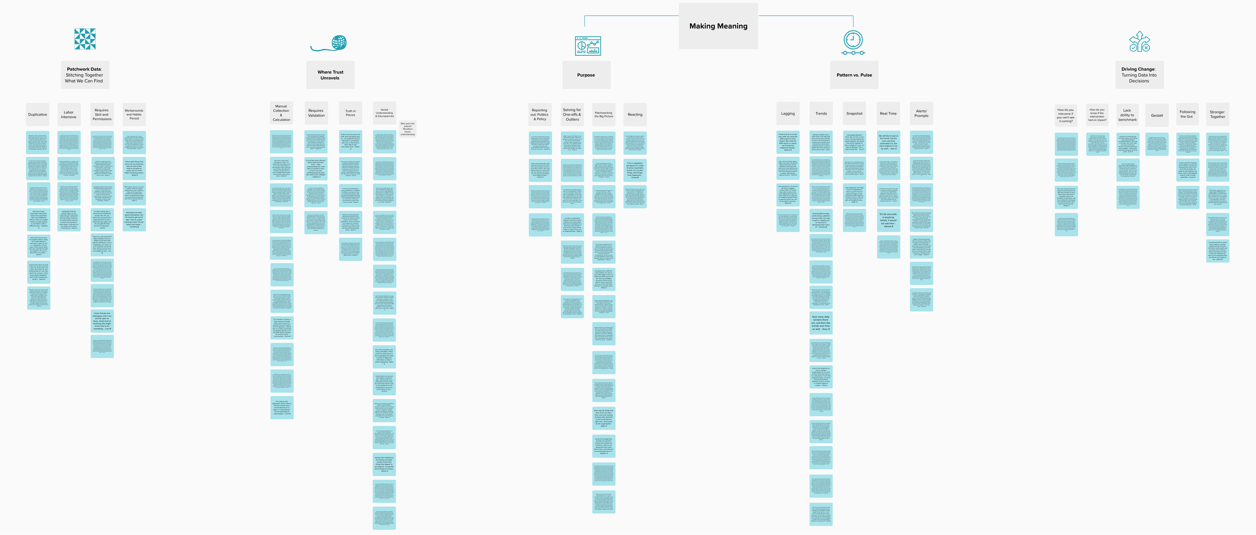
Key themes from semi-structured interviews
“And it’d be nice to know when interventions are placed, right? Here’s where the intervention was placed. So, here’s your historic data, here’s with your intervention, here’s where you are now. So, just in addition to looking at annual data, for example, it’s a really important thing. When did we put a process in place? Have our processes actually resulted in the condition we wanted?”
Where Metrics Move the Needle
The team reviewed the literature, assessed the hospital landscape, and shared data tools used at ZSFG, then paired those findings with discovery insights to clarify priorities. Grounded in stakeholder input on the most urgent needs, we identified phase-one KPIs that were both high-impact and achievable—advancing meaningful progress while remaining grounded in the hospital’s True North goals.
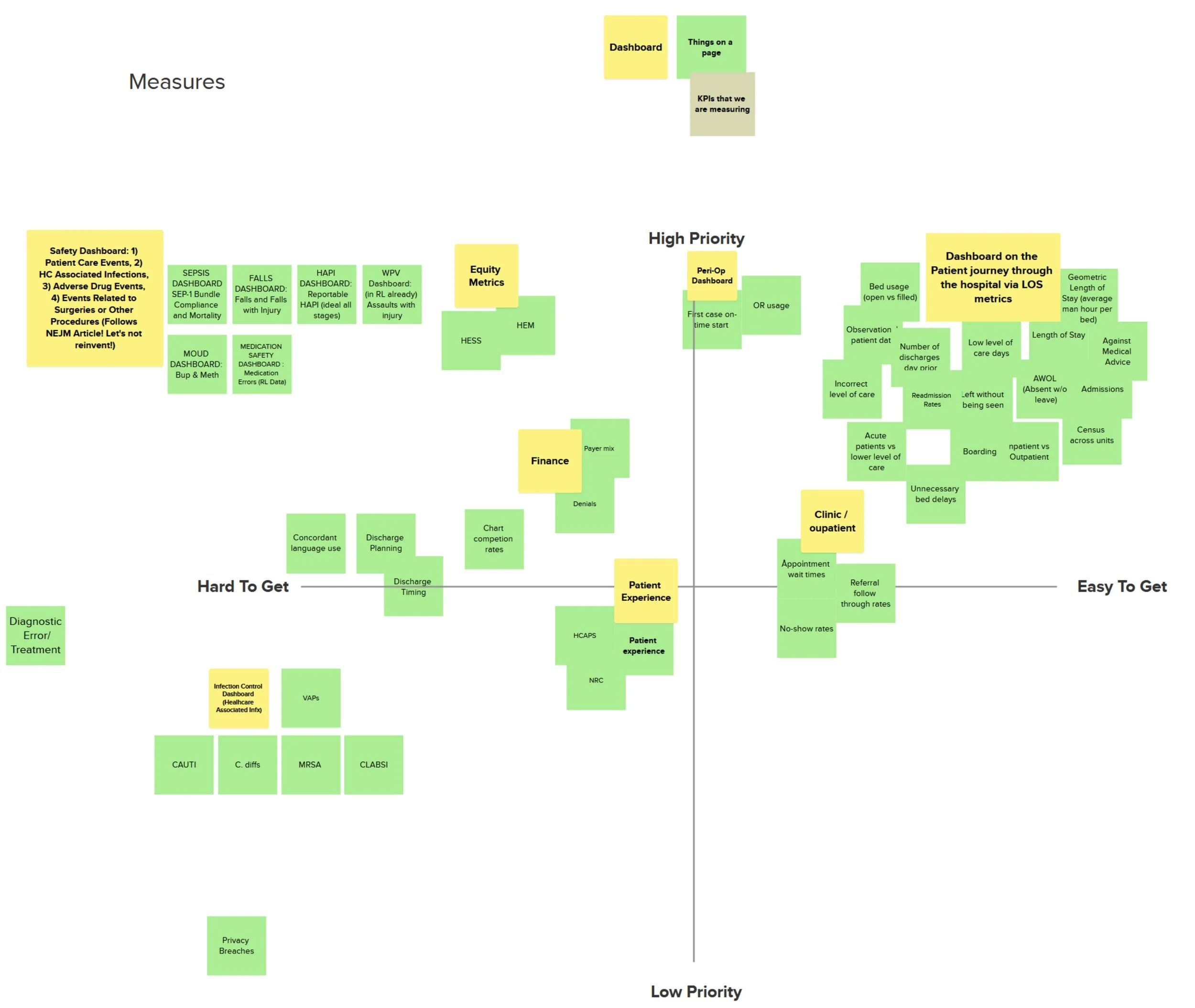
Generating and prioritizing KPIs
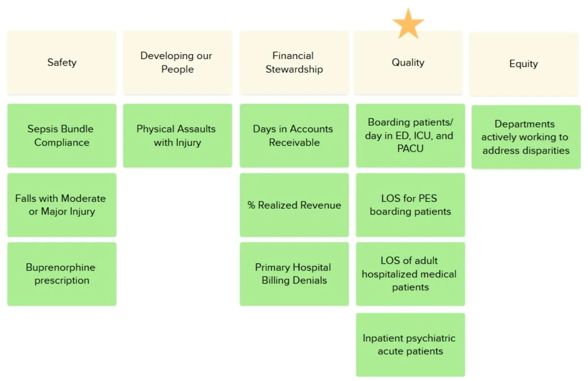
Strategically aligning KPIs with the hospital’s True North goals
Bringing the Dashboard to Life
I facilitated three interactive co-design sessions, creating a collaborative space where the team could directly shape the dashboard’s vision. Through these sessions, we defined a framework to guide the dashboard’s structure and functionality. We began sketching data displays that were both understandable and actionable, determining the most effective ways to present key metrics.
Building on these insights, I developed initial mockups and worked closely with the team to iterate on them. This process incorporated the dashboard’s data dictionary, technical specifications, and clear documentation of data sources, ensuring the information was trustworthy. Feedback from leadership further refined the designs, making them actionable, relevant, and aligned with real-world workflows.
To ensure long-term consistency and usability, I created a comprehensive style guide and branding assets for team members developing the Power BI site and integrating data, providing clear guidance to maintain a visually cohesive and user-friendly dashboard experience.
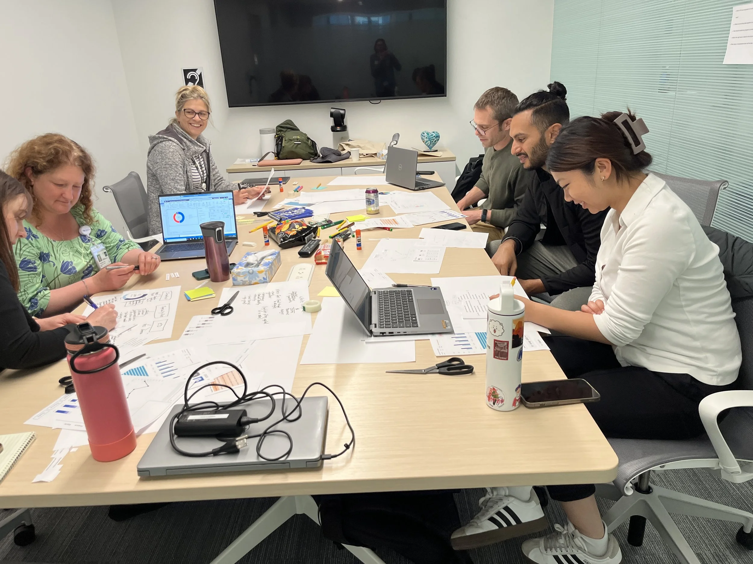
Co-design session with stakeholders from multiple departments
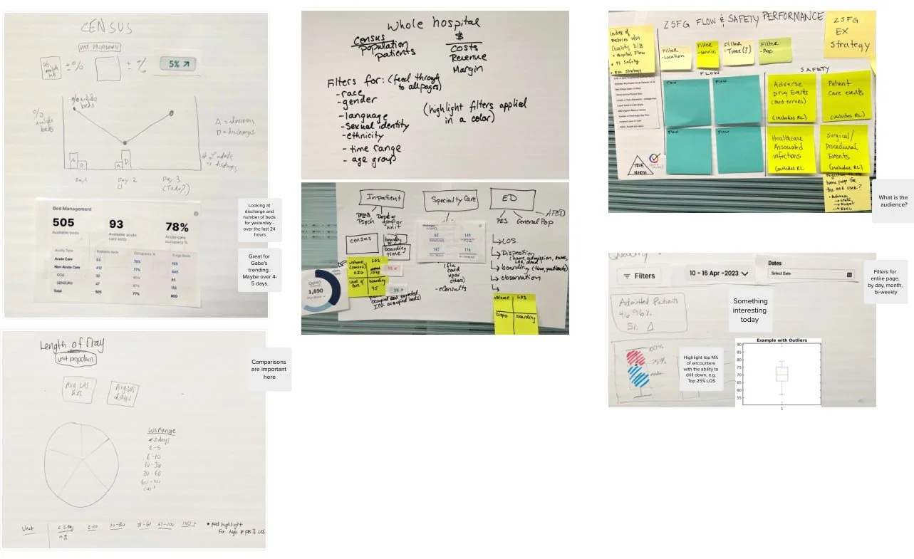
Co-design sketches exploring which data to integrate and how to display it for clarity and impact
Team feedback on iterative design mockups and graph visualizations
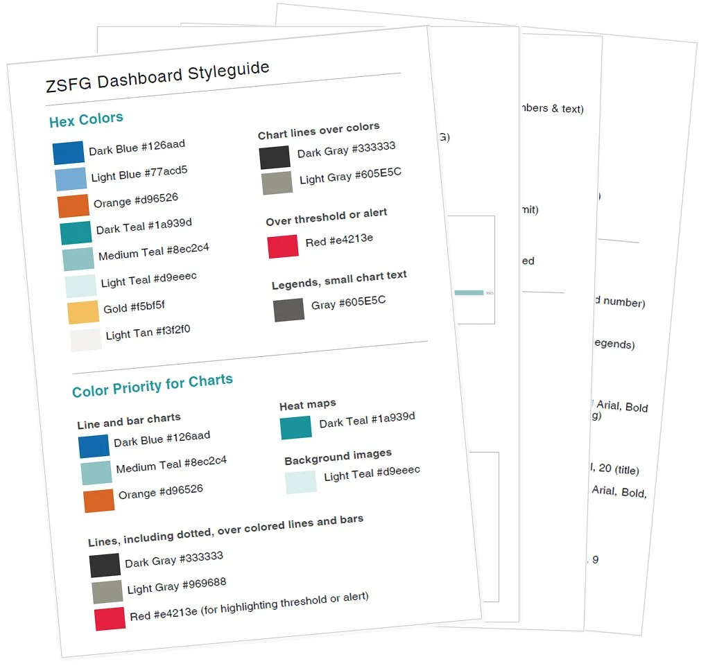
Styleguide for colors, charts, fonts and graphics
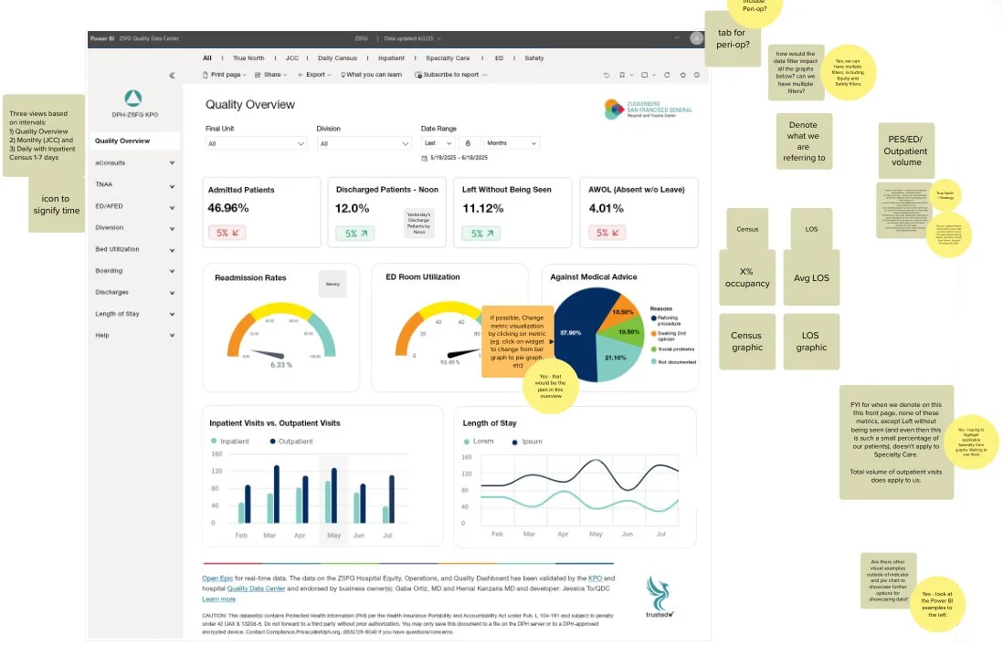
Wireframing and Visualizing Complex Data
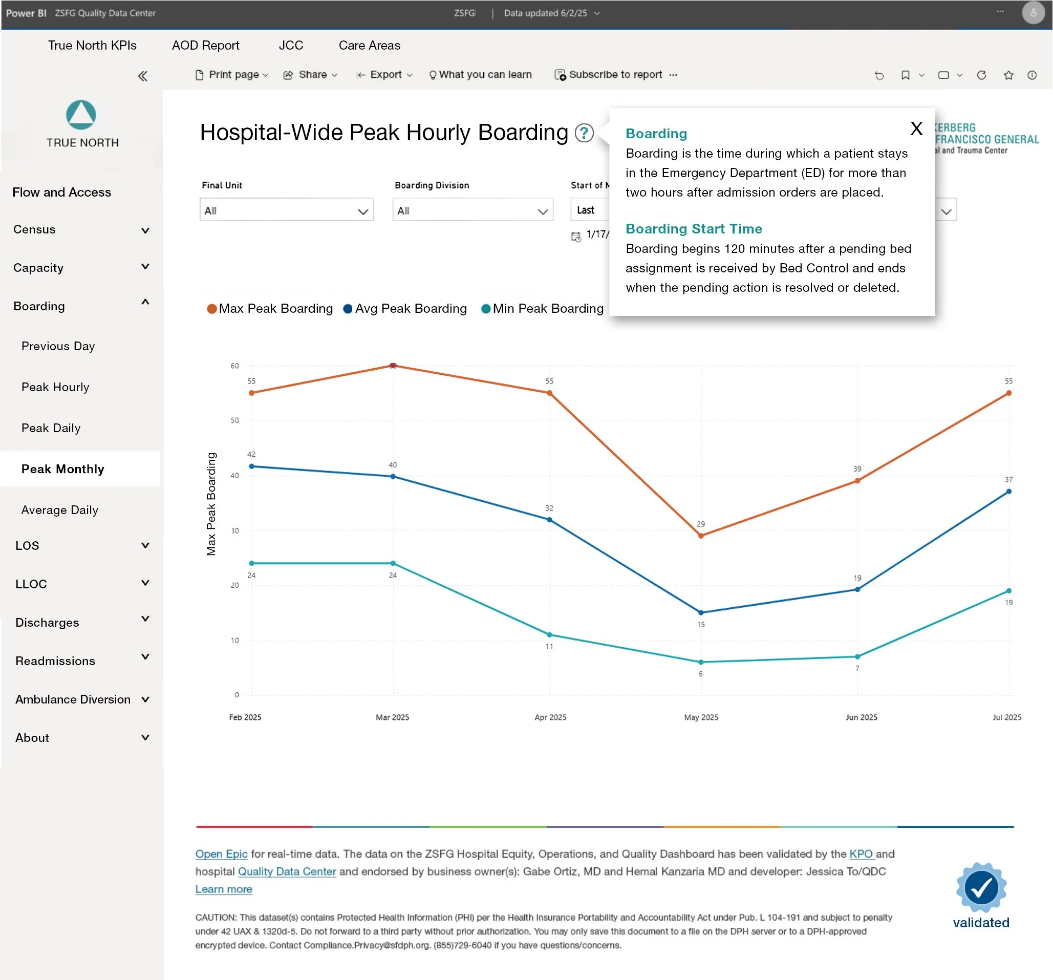
I developed high-fidelity wireframes to gather feedback from leadership and guide the design of dashboard screens and data visualizations, working within Power BI constraints and following ZSFG design standards.
Primed for Testing
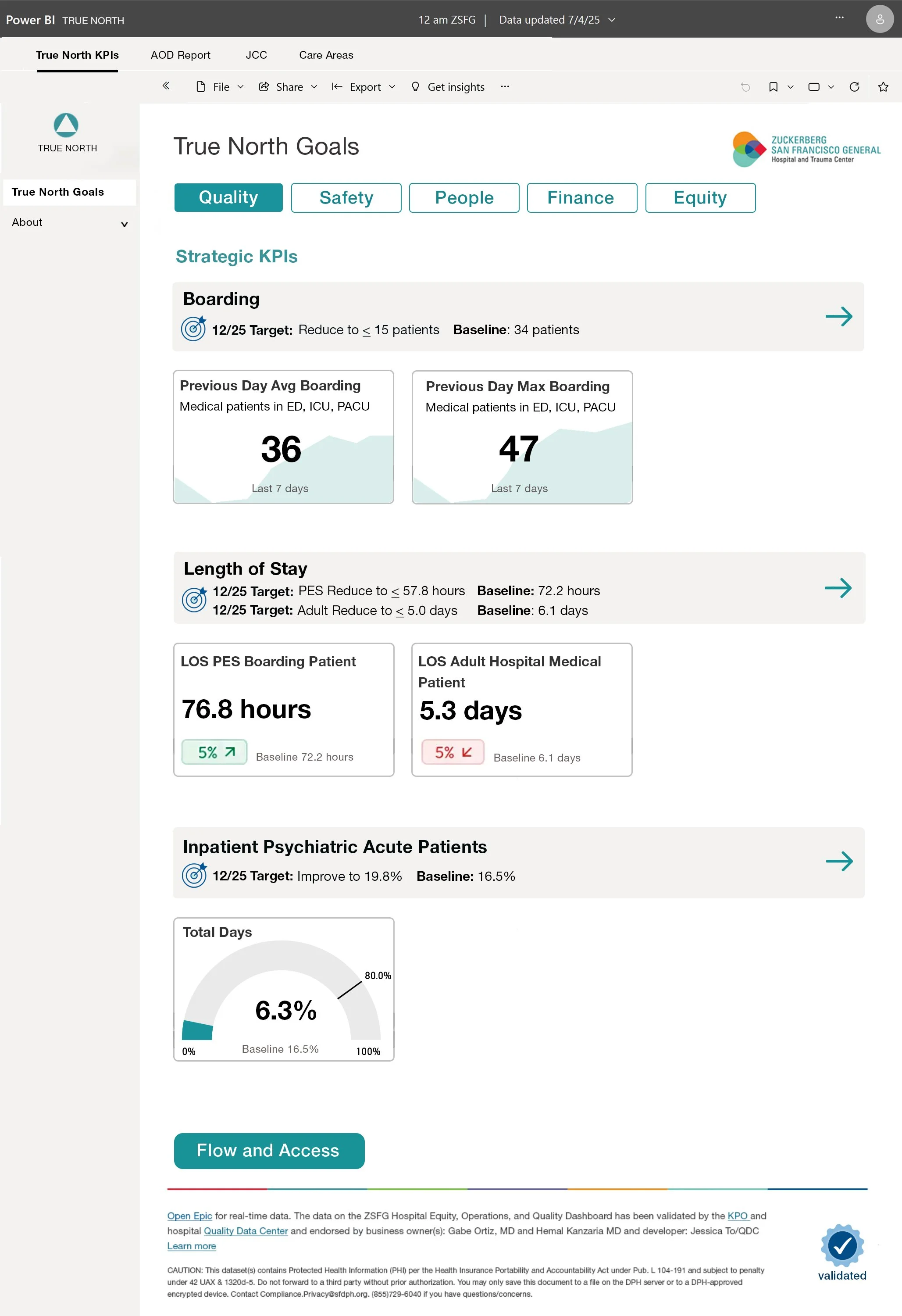
After incorporating feedback and the team completing the significant work of learning Power BI and consolidating multiple dashboards, the hospital-wide Power BI dashboard was launched for testing and stakeholder feedback. Key benefits include a CMO daily report—previously compiled manually each day—and an automated monthly report for the city.
My Work
Engaged key stakeholders across ZSFG, including clinicians, department leaders, operational managers, Equity Council, KPO, Patient Safety, and Quality Improvement
Co-led workshops to clarify user needs and guide design, facilitating exercises like Assumption Mapping, Success Metrics, Stakeholder Mapping, Value Proposition, Vision Statement, Champions Matrix, and co-creating the interview guide
Synthesized insights and incorporated learnings from team literature reviews, assessment of the hospital landscape and existing data tools
Performed semi-structured interviews with 22 stakeholders, extracting key themes on metrics, data requirements, and challenges
Defined and structured three phases of design and development from discovery through implementation
Facilitated co-design sessions to refine dashboard vision and data displays
Iterated on mockups and graph designs for clarity and usability
Developed a style guide and branding assets to support the Power BI build
Outcomes and Impact
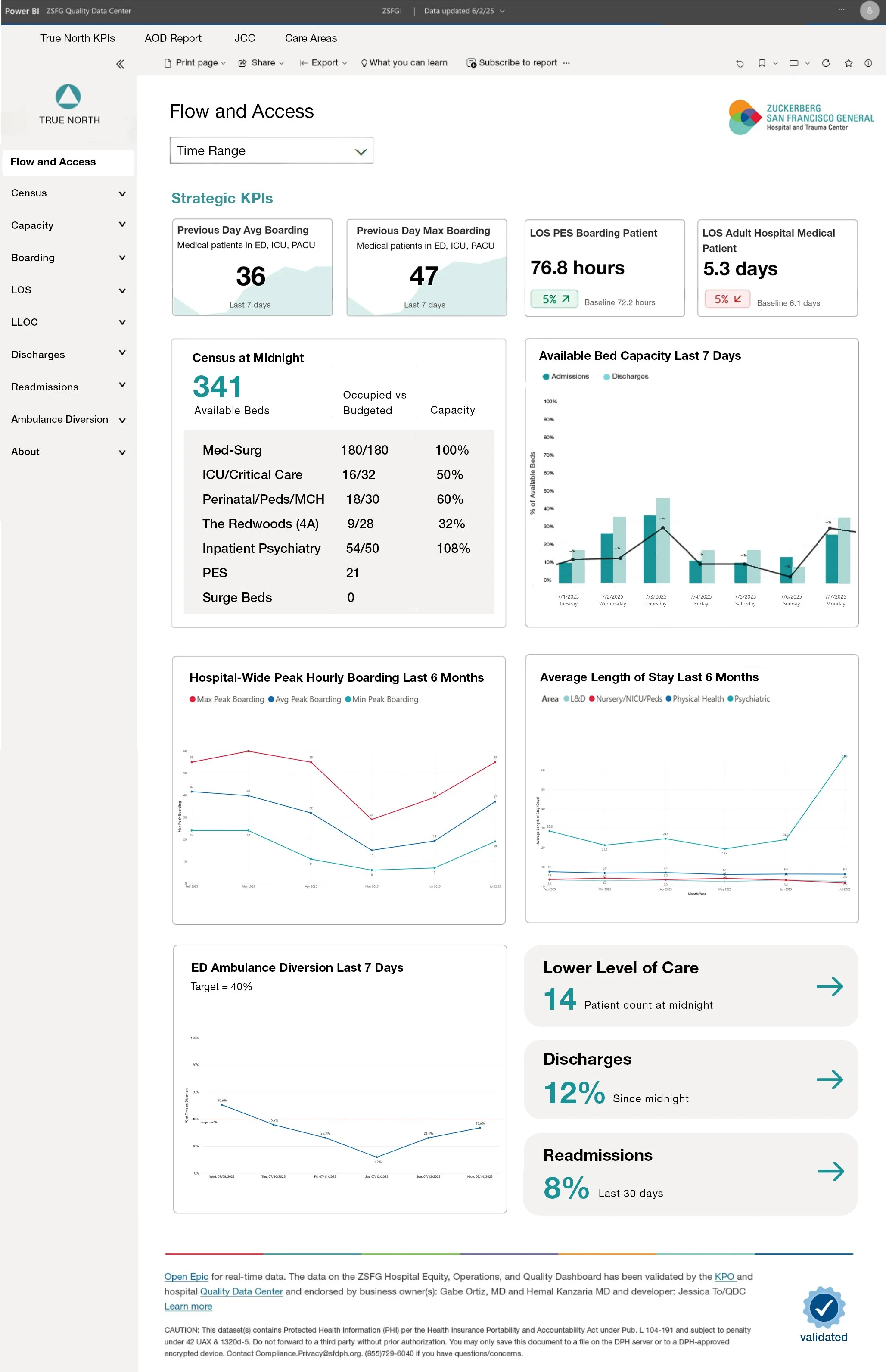
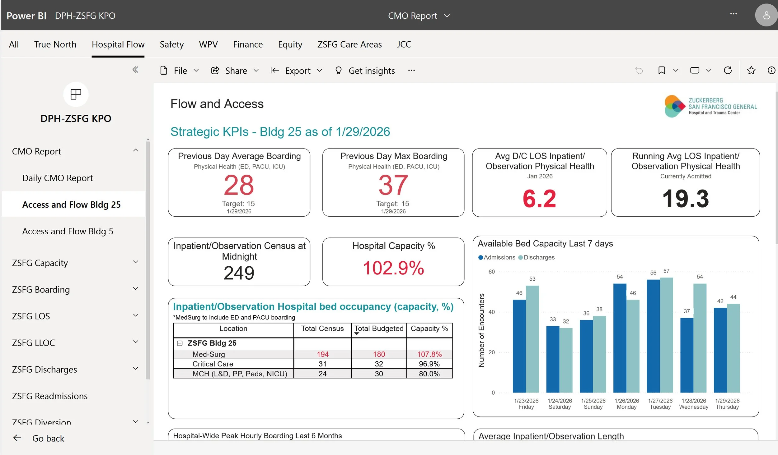
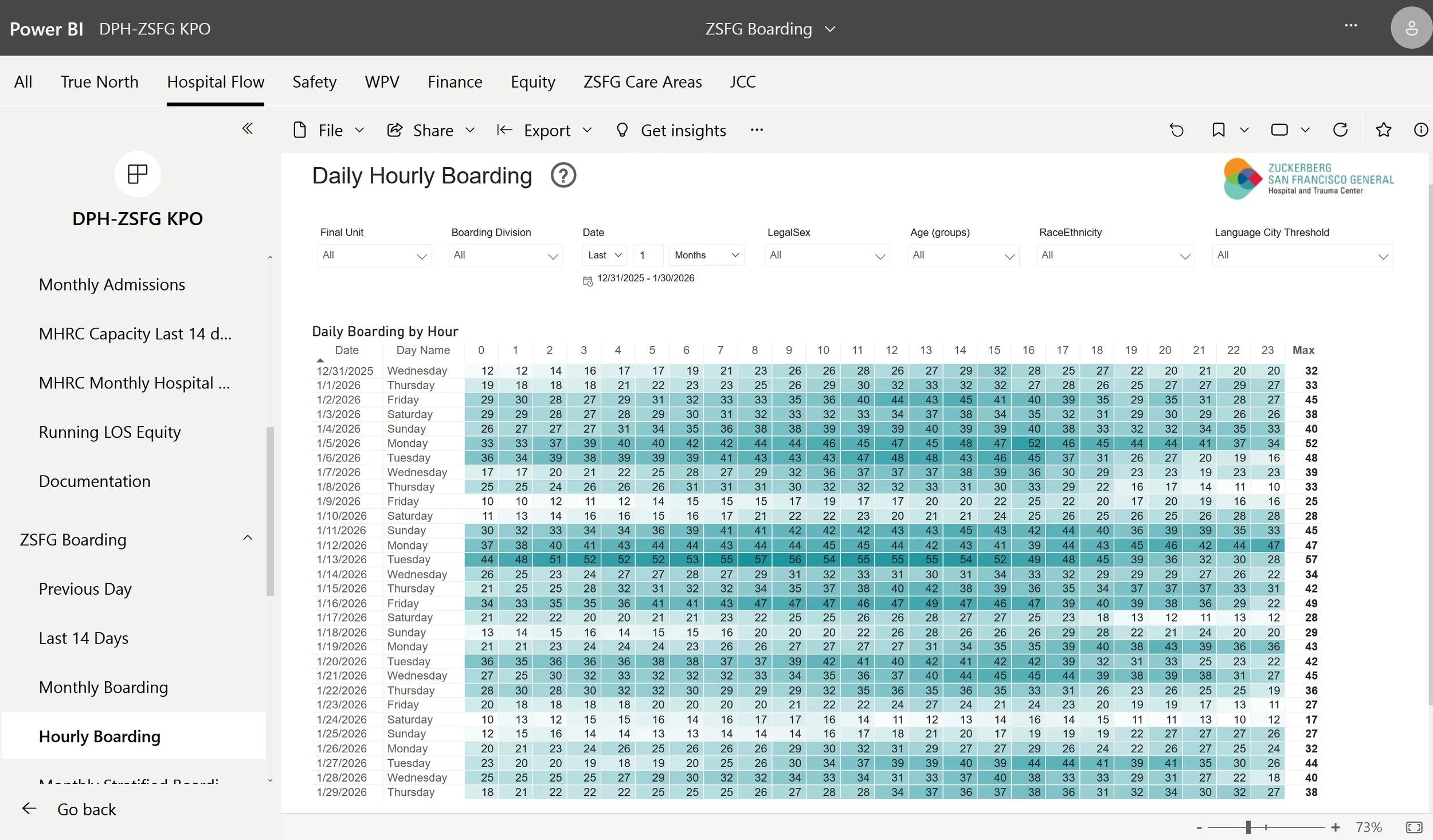
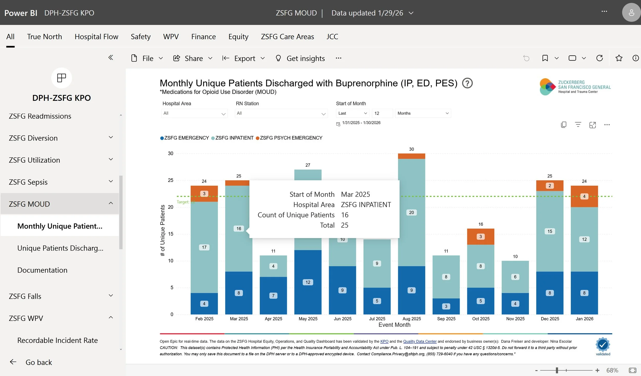
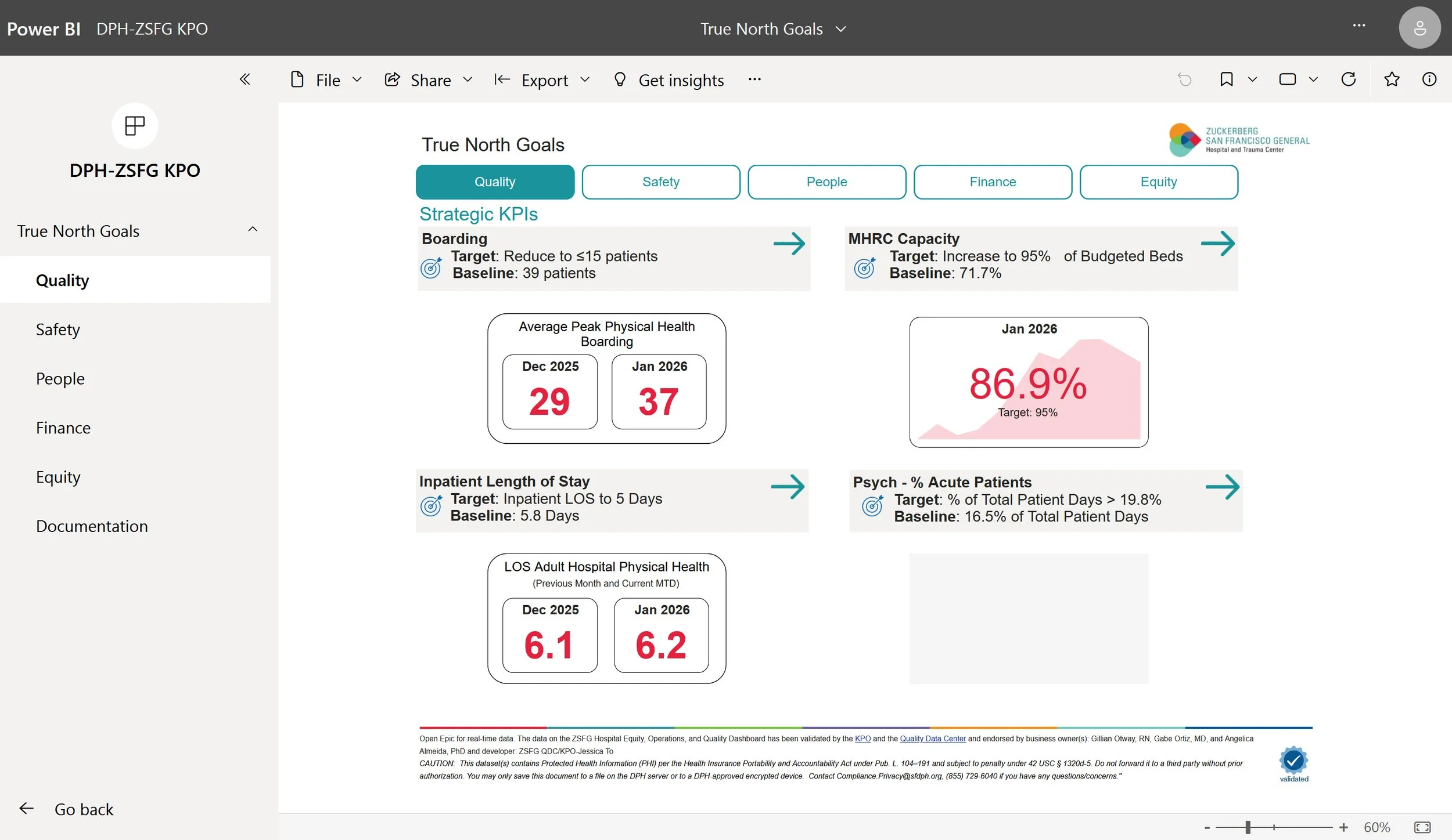
The project successfully translated design and discovery work into a functional, phased dashboard rollout. Phase 1 launched to the hospital in February 2026, introducing KPIs focused on patient flow and access—tracking ED to admissions to boarding, daily census, and length of stay—integrated through Clarity and implemented in Power BI.
Next steps include usability testing and the development of training guides. Future phases will expand visualizations, streamline workflows, integrate harm and quality management data, and enable real-time data access.